SITA

Designing global Advanced Passenger Risk Screening & Management systems

Overview

This project focused on redesigning SITA’s global border security platform a core risk-screening system used by government agencies to assess and manage passengers before and during travel. The application combined match-driven scoring with complex rules-based logic to identify potential threats, enabling border officers to profile travellers, manage targets, and make confident decisions in real time.


As Lead UX/UI Designer, I worked across multiple agile teams to modernise the user experience, streamline multi-step workflows, and unify search, profiling, and management tools into a cohesive interface. The redesign introduced a cleaner information hierarchy, accessible layouts, and a consistent visual framework adaptable to local languages and regulatory requirements.


My goal was to bring clarity and confidence to an environment where officers operate under pressure, helping them interpret automated insights quickly and accurately.


case study grid image 
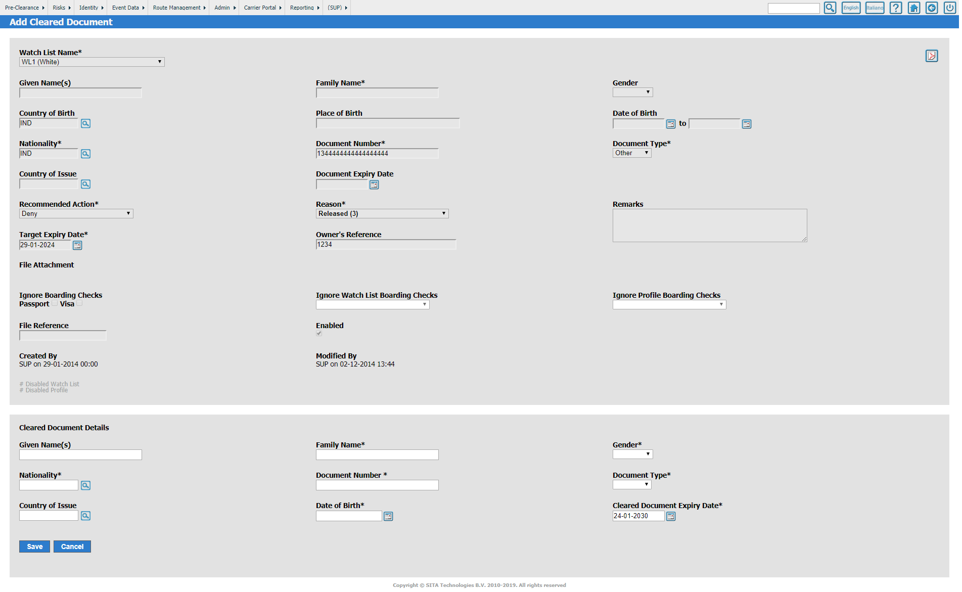
Old outdated form based legacy system

The Challenge

The legacy system had evolved over many years through incremental updates, driven by client and regional variations. Users were faced with inconsistent layouts, duplicated functions, and data presented in dense, difficult-to-read formats. New officers required significant training, and even experienced users struggled to interpret the logic behind automated risk scores or cross-reference passenger profiles efficiently.


Additionally, fragmented search and management modules meant that a single case might require jumping between multiple screens, slowing down decision-making during live operations.The challenge was to simplify this environment without compromising analytical depth or security bringing together disparate tools, models, and datasets into one intuitive and transparent user experience.

My Approach

I began with a UX audit of the existing system, mapping all major user journeys and identifying friction points across search, profiling, and risk-management workflows.Through collaboration with product owners, data specialists, and front-end developers, I built a detailed set of prototypes demonstrating a new visual language, layouts, design patterns, and interactions. To ensure designs aligned with operational needs, I ran iterative feedback loops with internal stakeholders and border-security officers, refining screens based on validation sessions.


Accessibility and scalability were central to the process all components were optimised for multilingual environments. Off shoot products conformed with ADA guidelines to support kiosk and eGate interfaces used globally.


User Research Image We iterated via multiple workshops
User Research Image 
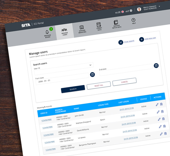
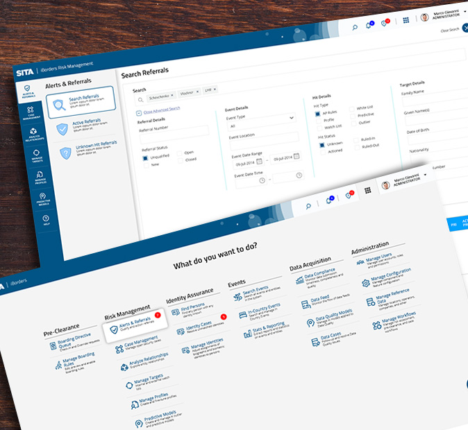
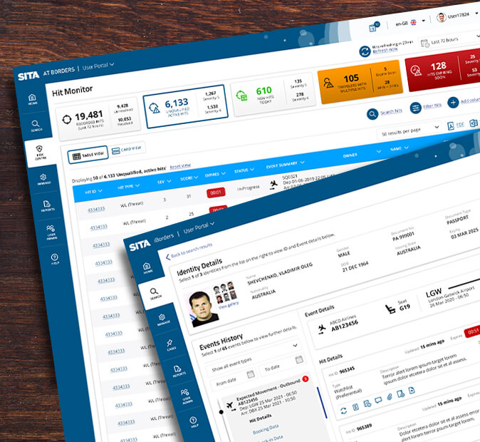
A modern optimised web application

Solution

The final design delivered a unified, modular interface that brought together passenger screening, target & profile management, and user-administration functions under a single visual language. A new navigation framework allowed officers to move seamlessly between passenger records, flight events, and alerts, while contextual data views made it easier to understand why a traveller was flagged. I introduced structured dashboards for rapid risk triage, a visual alert hierarchy to surface the most critical cases, and advanced filtering tools to reduce search time. The system’s architecture now supports adaptive modules enabling new AI models, risk rules and user management to be added without redesigning the interface.


The redesigned platform improved the speed and consistency of decision-making and provided a foundation for other SITA risk-assessment and analytics products.


UI Output

User Research Image 
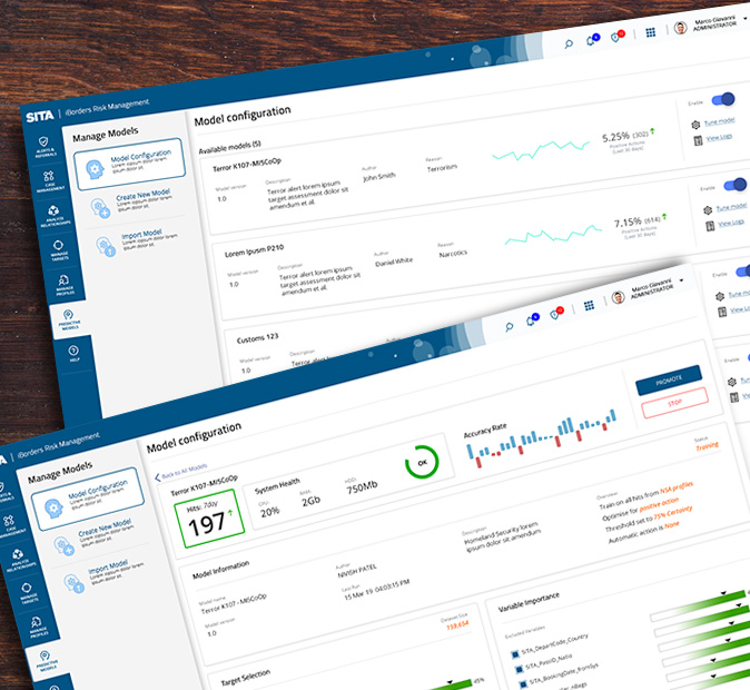
AI predictive risk assessment model management
User Research Image 
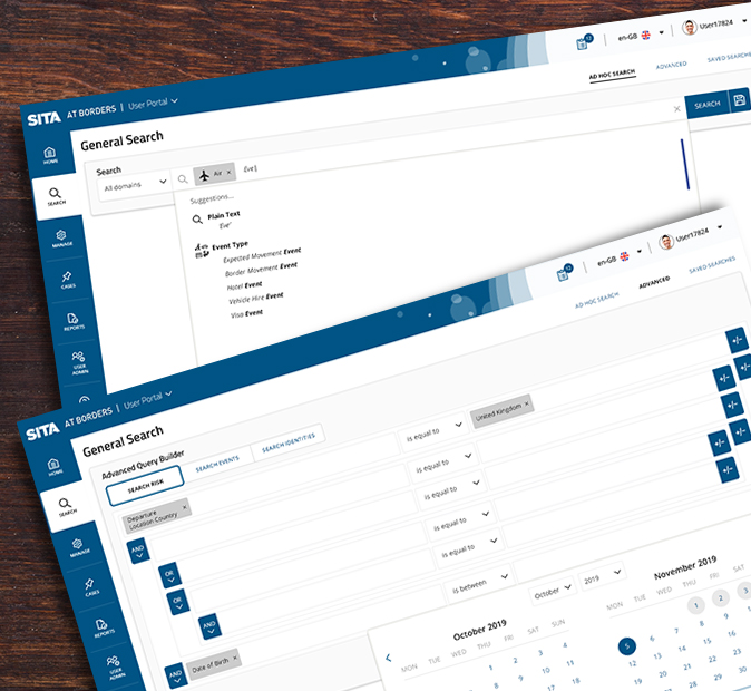
Advanced multi entity search capability
User Research Image 
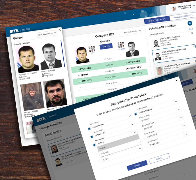
Multiple identity management
User Research Image 
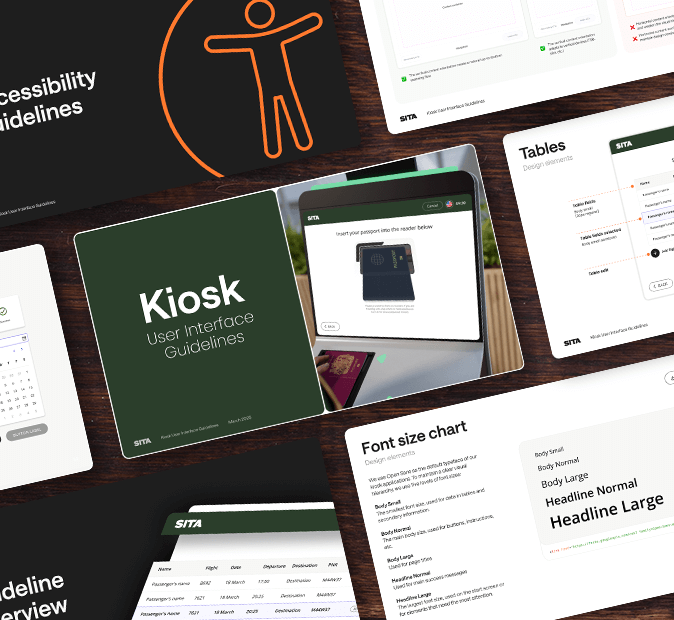
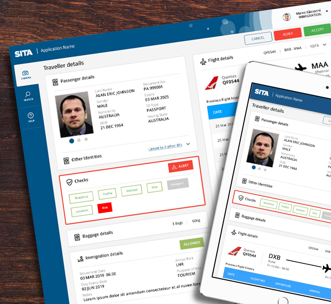
Fully responsive solution for portability
User Research Image 
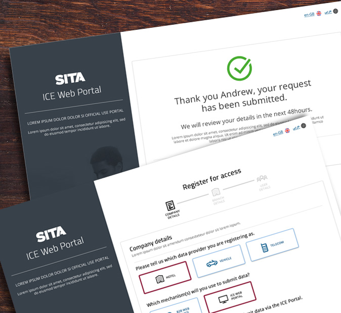
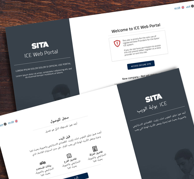
Multi language and localisation support
User Research Image Easily brandable adaptable design system
User Research Image Frontend data submission for travel vendors
User Research Image 
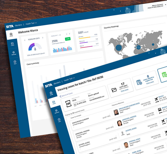
Integrated case managment tools
User Research Image Integration with immigration desks
User Research Image 
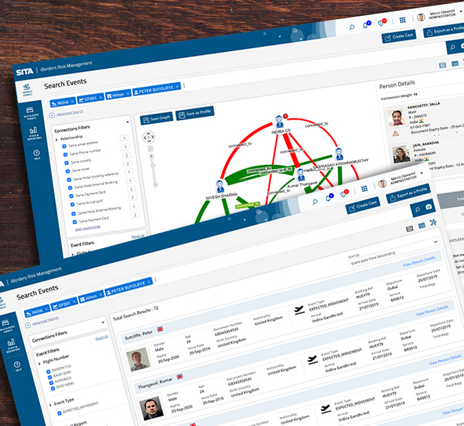
Dedicated entity relationship mapping
User Research Image Multiple plugin modules
User Research Image Risk monitor workflow and case management
User Research Image 
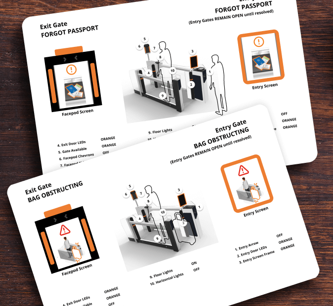
Risk module integration across entry kiosks
User Research Image 
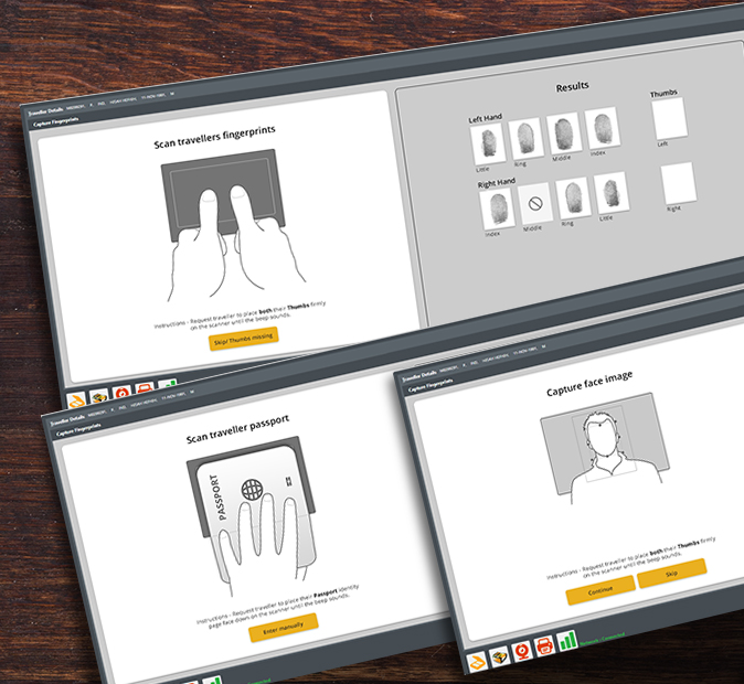
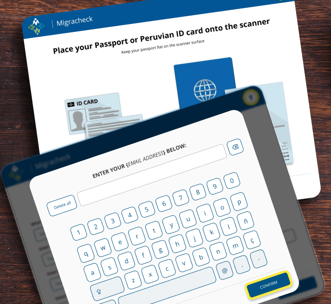
Touch optimised entry exit kiosks
User Research Image 
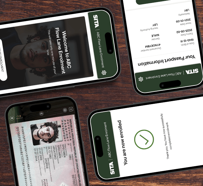
Integration across automated flow app
User Research Image Multiple touchpoints for risk assessment

Outcome

This project reinforced the importance of clarity and trust in complex data-driven risk systems. By simplifying data presentation and visual logic, I helped shift the officer experience from reactive searching to proactive assessment. The unified design increased confidence in risk/ referral management, reduced training time, and positioned SITA’s risk portfolio for future integration with new predictive and visual-analysis tools. Most importantly, the work demonstrated how user-centred design can enhance national-level systems improving accuracy, transparency, and usability without sacrificing complexity or control.