SITA’s software ecosystem spans nearly a hundred digital products each serving different clients, domains, and platforms, from border security to airline operations. These products were built by globally distributed teams using a wide variety of front-end frameworks and technologies, resulting in inconsistent user experiences and fragmented visual languages across the portfolio.
I was brought back to SITA on a dedicated contract to lead the design and creation of a company-wide Design System, uniting multiple product portfolios under one consistent, scalable framework. My role was to define the foundations, lead cross-functional collaboration, and create the reference blueprint in Figma that would drive UI and UX consistency across all desktop, mobile, and kiosk applications.
Each SITA product team operated independently often using unique toolchains, coding languages, and ad-hoc style guides. While this autonomy enabled speed, it resulted in visual fragmentation, duplicated effort, and reduced design scalability across the organisation. The challenge was threefold:
The initiative began with a series of stakeholder interviews and discovery workshops. I spoke with: Product designers and developers from all major portfolios; Senior Portfolio Leads; The UX Practice Lead; Frontend Development Practice Lead; These sessions helped uncover the current pain points duplicated work, inconsistent components, unclear standards, and a lack of visibility between teams. From this foundation, I mapped design system objectives to practical needs, balancing flexibility with structure. 
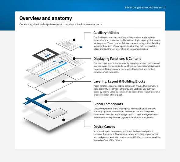
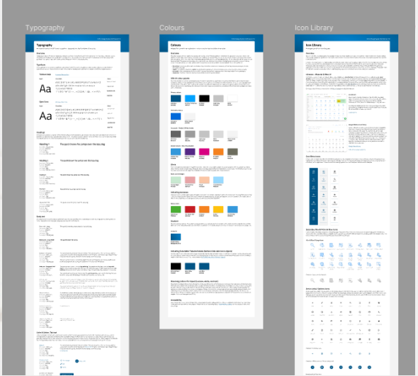
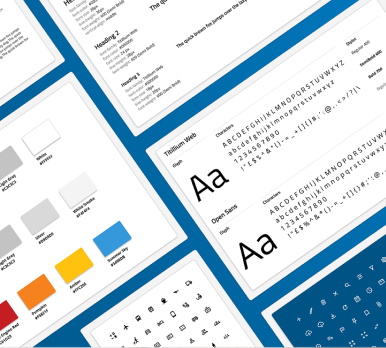
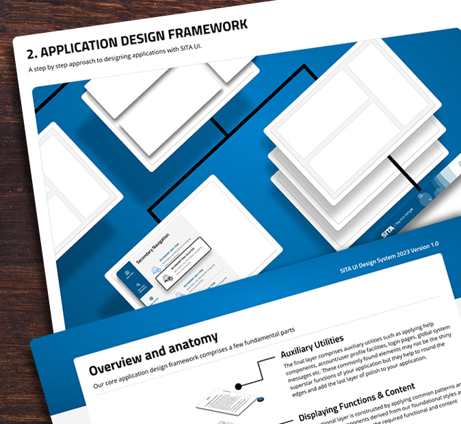
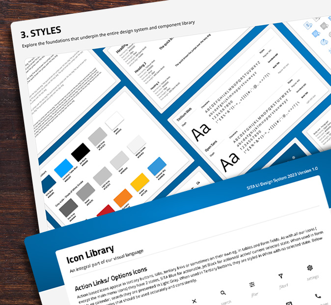
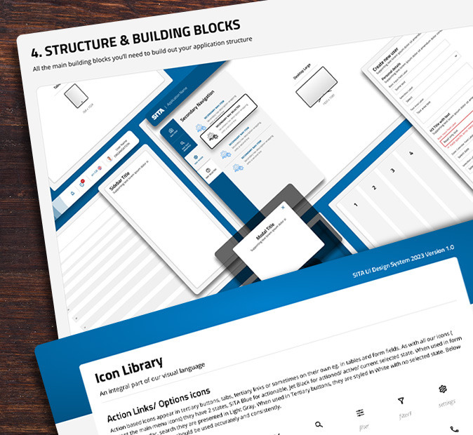
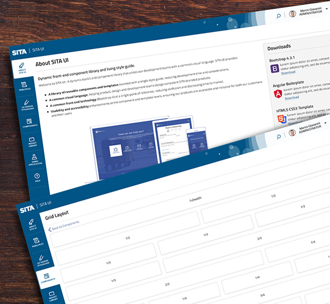
I then conducted a full audit of existing SITA applications, collating patterns, typography scales, and color systems from over a dozen major products. I used this research to establish core design foundations, including color palettes, grid systems, spacing scales, typography, and reusable interaction patterns, based on atomic and molecular design principles completely agnostic of any frontend code. 
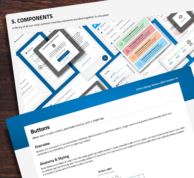
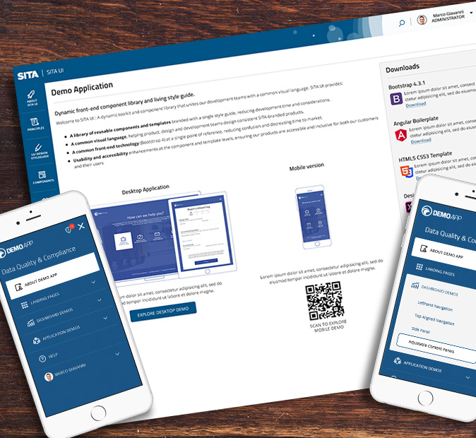
Using Figma, I worked with other senior designers to construct a shared component library, housing foundational elements (buttons, inputs, menus, tables, navigation) and scalable page-level templates. Each component was designed with clear constraints, naming conventions, and usage guidance, documented within a 70-page design “bible” that covered principles, rationale, and implementation rules. In parallel, I collaborated with a lead developer to reproduce the component library in Storybook using Angular/JavaScript, ensuring that the design tokens, measurements, and interactions could be accurately replicated in live environments.
The resulting Global Design System became the backbone of design consistency across SITA’s product ecosystem:
The SITA Global Design System became the cornerstone of design maturity across the organisation. It aligned design and engineering teams working in silos and established a consistent visual identity across all customer-facing and internal products. Its adoption led to faster prototyping, reduced rework, and improved design-to-development fidelity. The modular framework also made onboarding new designers significantly faster enabling distributed teams to deliver coherent products in shorter cycles. For me, this project demonstrated how governance, not just design, defines scalability. By grounding the system in universal principles and atomic methodology, we created a foundation capable of evolving alongside SITA’s products for years to come bridging the gap between creativity, accessibility, and code flexibility.