SITA

Building a series of travel based risk assessment visualisation tools

Overview

This project involved designing a suite of advanced visualisation and analytical tools used by government agencies and border-control analysts to monitor flight and passenger risk across global travel networks. The tools enabled real-time tracking of flights, passengers, and associated entities displaying data through dynamic map-based interfaces and relationship models.


As Lead UX/UI Designer, I collaborated with data scientists and engineers to translate complex predictive models into clear, actionable visuals suitable for high-stakes operational environments such as control rooms and investigation centres.


The goal was to give analysts immediate situational awareness transforming static data into living risk intelligence through visual clarity, layered context, and intuitive interaction patterns.


case study grid image An outdated tool that needed modernisation

The Challenge

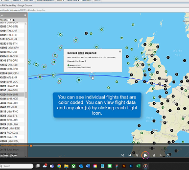
Existing systems relied on simple dashboards and manually compiled reports that offered limited interactivity and limited correlation between entities. Analysts struggled to understand how individuals, flights, and events were connected, making it difficult to trace suspicious patterns or act on early-warning indicators.


The challenge was to create a visual framework capable of presenting dense, constantly updating information without overwhelming the user. It needed to balance speed, scale, and clarity, providing a seamless experience whether viewed on a laptop in the field or across multiple large displays in a national operations centre. The interface also had to support flight and traveller data from multiple jurisdictions, each with unique privacy and localisation constraints.

My Approach

I began by mapping out the analyst journey from initial alert to hit investigation to understand what information they needed to see first, what details required context, and how decisions were made collaboratively. Through workshops with product managers and technical architects, I identified the visual metaphors that could translate complex risk relationships into intuitive visuals: nodes,flight routes and a selection of key entities like payment and traveller details . Using Figma, I created interactive prototypes showcasing different data layers flight data, passenger data, and risk-based activity. I conducted iterative reviews with end-users, refining iconography, labelling, and animation pacing to prevent cognitive overload. Every visual element was optimised for clarity in dark control-room conditions, tested for accessibility, and designed to integrate seamlessly with SITA’s evolving design system.


User Research Image 
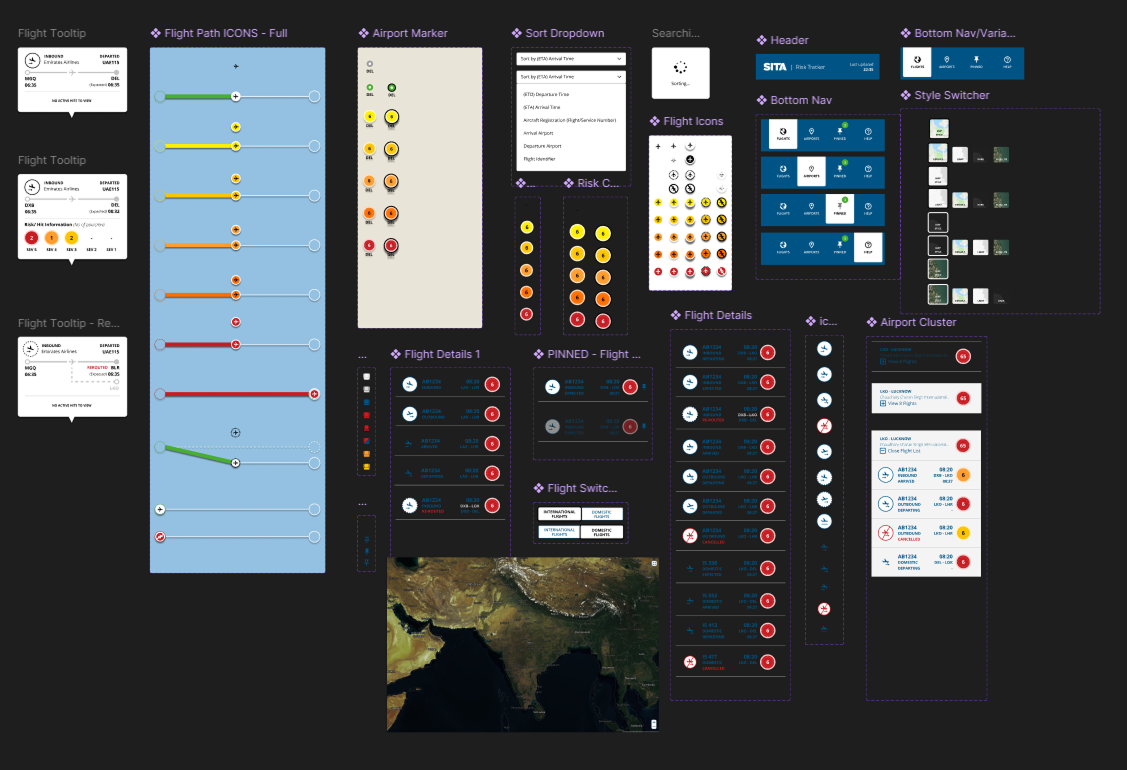
A snippet of a comprehensive design system
User Research Image 
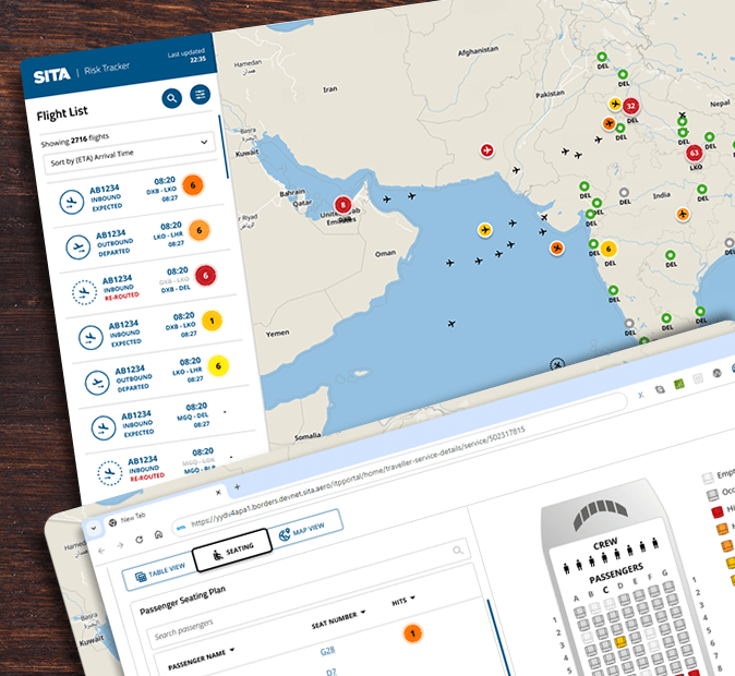
Fully localised flight & risk tracking

Solution

The final design introduced a multi-layered interactive map that allowed users to toggle between flights, passengers, and risk events. Each layer displayed risk scores and confidence levels visually, allowing quick differentiation between alerts and contextual data. A secondary tool presented relationship mapped insights such as shared routes, payment methods or recurring associations between entities. The relationship-mapping view enabled analysts to trace connections between individuals, addresses, and flights in seconds.


The result was a responsive, high-performance interface that transformed abstract data into actionable intelligence.


UI Output

User Research Image Live flight and passenger data tracking
User Research Image 
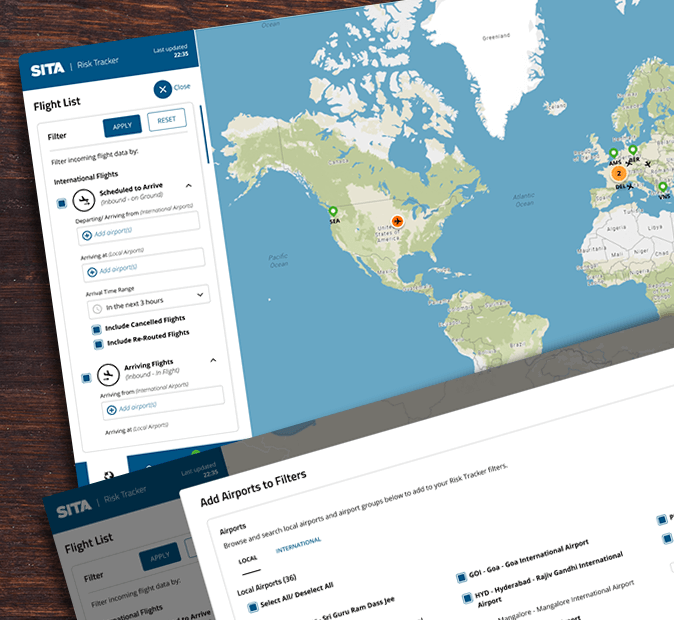
Complex flight data filters
User Research Image 
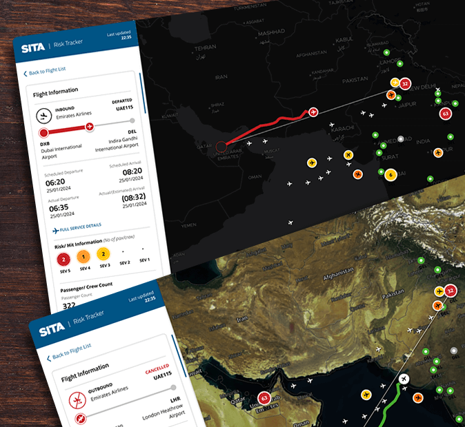
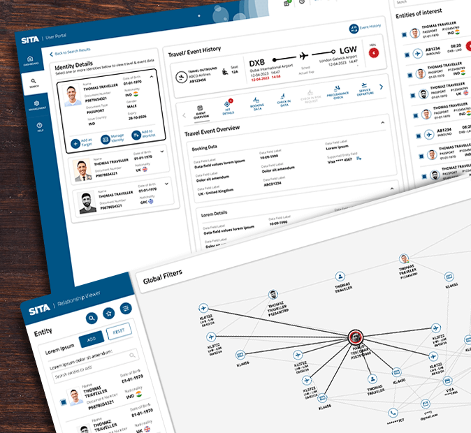
Relationship mapping screens integrated with core product
User Research Image 
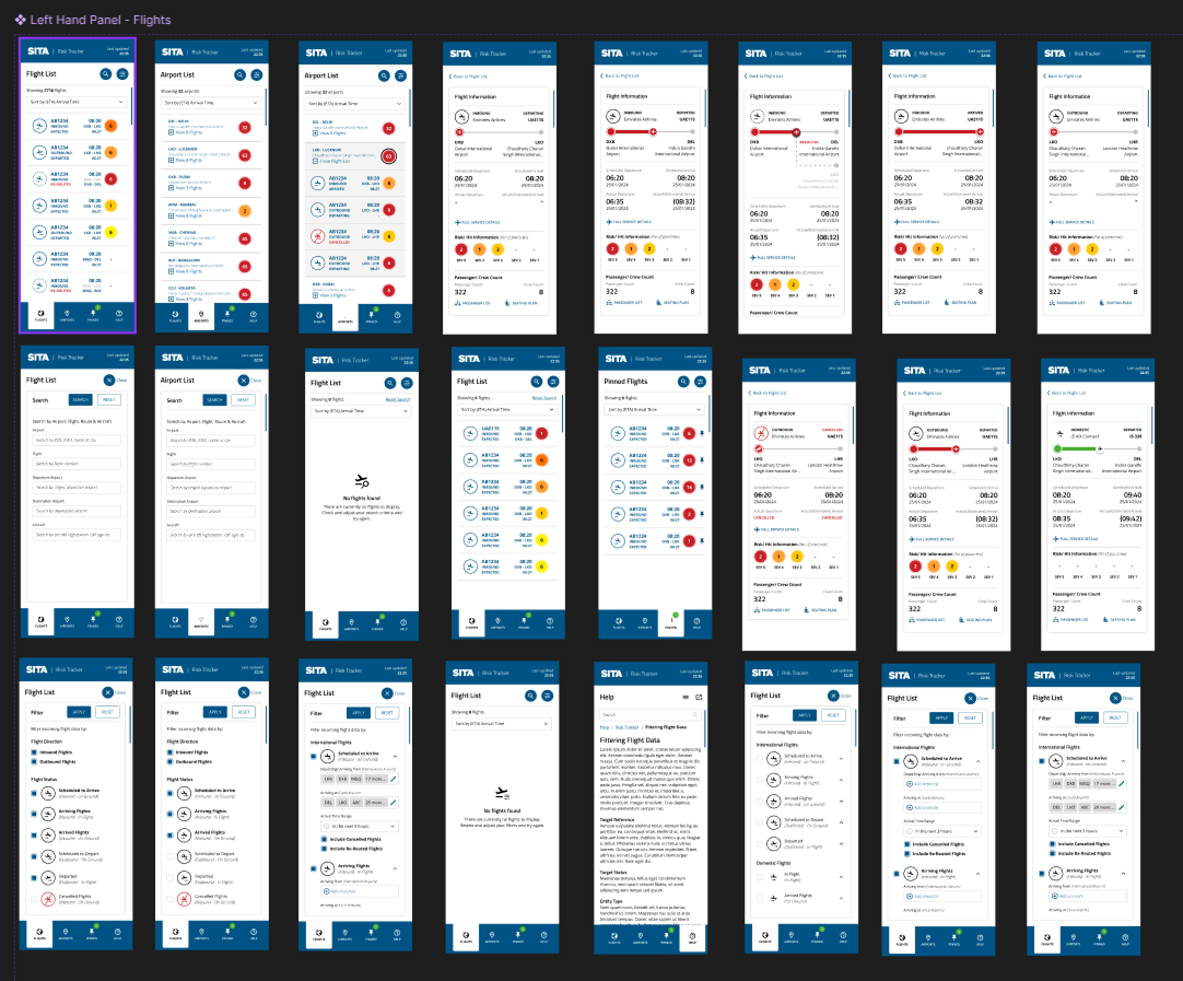
Comprehensive mapping of multiple interaction states

Outcome

This project deepened my understanding of how design can enhance decision-making under pressure. By converting predictive analytics into clear, human-readable visuals, the tool empowered analysts to act faster and with greater confidence. The design set a new benchmark for how SITA visualises complex risk data improving the solutions offering within the company’s border-management portfolio. Beyond visual polish, the true success lay in creating trust ensuring that every data point, connection, and score was represented in a way that analysts could both understand and justify.