Good UX design starts with curiosity understanding the people, systems, and constraints behind a problem before shaping a solution. For me, it’s about making things make sense: distilling complexity, aligning teams, and designing experiences that people can actually use, not just admire. Every project has its own context, but the principles stay the same evidence over assumption, iteration over ego, clarity over decoration. For me, design is a problem-solving discipline grounded in empathy and logic. It’s not about decoration, nor is it just process it’s about clarity. Good design removes friction, reveals meaning, and gives people the confidence to act. Whether building a system that supports thousands of users or refining a single flow that helps one person succeed, my goal is always the same: make complex things simple, make important things visible, and make technology feel human. When I engage in a full end to end process it looks something like this:
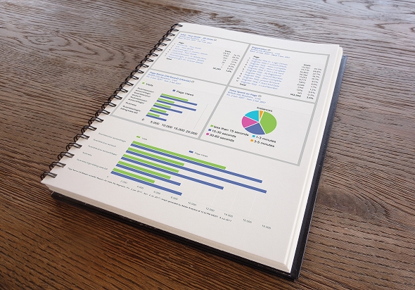
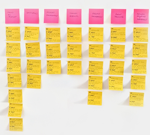
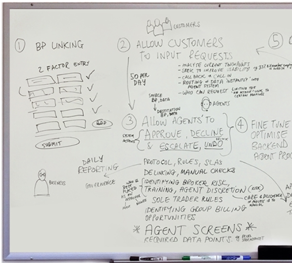
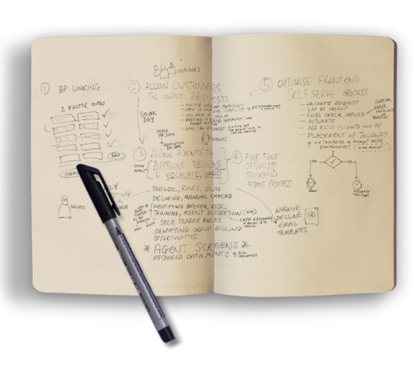
Before designing anything, I make sure I fully understand what needs to be solved. That begins with talking to people users, product owners, engineers, and operational teams to learn how things really work (and where they don’t). I look at data, workflows, support tickets, and analytics to see where friction lives. I also examine business goals, regulatory constraints, and any technology limitations that will shape the outcome. This stage is about alignment ensuring that everyone involved has the same understanding of the problem space and what success looks like. It’s often the most valuable part of the process because when the problem is defined clearly, good design becomes a lot easier to recognise.
I use both qualitative and quantitative research to uncover how people think, act, and make decisions. Sometimes it’s formal interviews, surveys, or observation sessions. Other times it’s informal talking to call centre staff, field operators, or internal users who know the product best. I balance this with data from analytics tools to understand behavioural patterns and conversion points.
The goal isn’t just to collect data but to turn it into insight something actionable that informs design direction. Research doesn’t have to be lengthy or academic to be useful; it just needs to bring clarity and empathy to the table. I’m a big believer in lightweight, continuous research embedded within the design cycle rather than isolated as a one-off exercise.
Once the insights are clear, I help the team define what success actually means. That might involve creating user stories, experience principles, or defining measurable objectives that connect design outcomes to business results. I also map dependencies, technical constraints, and stakeholder priorities to ensure that the project’s goals are achievable.
This stage sets the tone for the work ahead aligning product, design, and development around a shared vision. When teams skip this, scope creep takes over. When they do it right, decisions later in the project become far easier and more defensible because everyone understands why things are being designed a certain way.
Once the problem is clear, this is where creativity takes over. I love this stage exploring ideas, sketching, and finding unexpected ways to solve real problems. It’s a balance between thinking big and staying grounded in user and business goals. Ideation is a team effort.
I run collaborative whiteboard sessions and quick design sprints to explore multiple directions, then narrow down through divergence and convergence expanding to imagine possibilities, then refining what’s feasible and valuable. Market trends, emerging technologies, and outside perspectives often spark the best ideas.
By the end, we have a shared vision of the experience, the main user flows, and the approach we’ll take to bring it to life creative yet practical, and grounded in purpose.
I start to bring structure to the information defining how content, data, and features connect. This means creating user journeys, task flows, and IA maps that reflect how people actually think, not just how the organisation is structured. I often use Miro or FigJam for early mapping and Figma for flow diagrams and clickable path prototypes.
Good IA should feel invisible users shouldn’t have to think about where something is. I pay close attention to naming conventions, page hierarchies, and navigation states, ensuring everything supports orientation and comprehension. It’s about designing mental models that feel natural and predictable the foundation of every good product experience.
Prototyping is where ideas start to take shape and assumptions start to get tested. I create low- and high-fidelity wireframes to explore layout, hierarchy, and interaction patterns before investing time in final visuals. This allows teams to discuss and iterate quickly, keeping the conversation focused on behaviour and logic rather than aesthetics..
In Figma, I build prototypes that simulate real use cases, sometimes linking full multi-path journeys that can be tested end to end. These are invaluable for workshops and stakeholder reviews, helping everyone visualise the experience. For me, prototyping isn’t a deliverable it’s a communication tool that helps teams align faster and smarter.
Design decisions mean little without validation. I test early and often whether through structured usability sessions, moderated tests, or lightweight remote reviews. I also use quantitative validation where relevant, such as A/B testing or analytics monitoring to understand performance and behaviour after launch.
Testing isn’t about proving a point; it’s about learning. It’s okay for an idea to fail in testing that’s a success if it saves time and cost later. The important thing is closing the feedback loop and ensuring that insight from testing feeds directly into the next iteration.
Visual design brings everything together clarity, emotion, and trust. I focus on hierarchy, rhythm, and balance to guide the user naturally through a product. Accessibility is non-negotiable, and I design using flexible systems that support dark mode, localisation, and responsive behaviour from the start.
Over time, this work often evolves into formal design systems a shared language of tokens, components, and guidelines that ensure consistency across teams and products. I’ve built several from the ground up, combining UX foundations with scalable UI libraries that improve delivery speed and design quality across organisations. A well-crafted system lets creativity flourish because the fundamentals are already solved.
Handing off design isn’t a one-time event; it’s an ongoing conversation. I collaborate closely with developers, QA teams, and product owners to ensure that the final product matches both the design intent and user goals. That means detailed Figma specs, design tokens, and logic notes but also being available to adapt quickly when technical constraints appear.
Collaboration is the difference between a design that looks good and one that works well. I value partnerships where design and engineering share accountability, because that’s where great products come from mutual respect and shared ownership.
Once a product goes live, that’s when the real feedback begins. I use analytics dashboards, session recordings, and performance data to understand how it’s being used in the wild. Are people completing key actions? Are there drop-offs? Where are they getting stuck? These insights inform continuous improvement small, focused iterations that build real value over time.
I also believe in learning from what doesn’t work. Sometimes, what users don’t do tells you as much as what they do. Iteration isn’t about chasing perfection it’s about constantly refining a living product to stay aligned with user needs and business goals.